Main Page Content
How Visual Design Can Impact Your Bottom Line
A point of discussion among many clients is Should I invest more money into getting an updated design for my website?
This question is typically hard to answer because it is not always easy to see the impact from the investment on your bottom line. I recently had the opportunity to work with a national flower delivery site and was given the chance to try some new design concepts out. The site had remained consistent in its look and feel over the past couple of years with no major updates so I had a steady stream of analytics and conversion data for the before comparison.
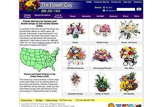
The Old Design
 The old design had a nice clean feel to it with not a lot of color in order to focus the eyes and interest towards the products being offered versus the design of the site. When it was created, simplicity was a central focus and that was apparent in the finished product. The site had a white background with a dark header and minimal light grays surrounding the product categories.
The Research
This type of minimalist design was the norm for most ecommerce related website 2-3 years ago and we are still seeing that trend carry over to even new designs being released today. However, people will associate trust with the overall look and feel of the website and if the site does not convey the message that it is associated with its target market it can lower a person's trust in the site thus decreasing the overall conversion rate. I recently read the website credibility study by the Persuasive Technology Lab at Stanford University which highlights that specific point by saying that 46.1% of people associate the design look
of the site when evaluating a site's credibility. This means by going with a super minimalist design you forego great branding opportunity and your site's chance to create a great credible first impression. While creating a clean, non distracting website is still very important, creating a site that utilizes design to create a consistent and accurate portrayal to your target market is just as important.
The New Design
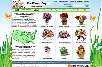
 When I began creating ideas for refreshing the design of the site, I took into consideration that the client was in the flower business and his website needed to convey that message. The easiest way to accomplish this was to integrate a floral pattern or design into the background. I am not a vector design artist but I like the custom look that a vector graphic can deliver and they can produce bright, vivid images so I was able to search through stock photo sellers and find a nice vector image that I could customize to fit my needs. It was important to pick a design that would not be overbearing so that a user could still focus on the products but would still create a since of attachment and belonging to the floral industry. After finding a great graphic, I was able to modify it in Photoshop to lighten the background and to move some of the internal components of the graphic to make room for the ecommerce container.
Now that I had the perfect
graphic, I was able to adjust the website's color palette to be consistent with the background's palette. This created a nice integration of the ecommerce storefront into the background and by keeping a white background for the container; the eyes are still able to easily focus on the individual products. The overall project did not take that much time and was ready to push to production at the beginning of May 2007.
The Results
After the new design was pushed to production we began to notice an increase in the conversion rate almost immediately. Below is a graph that charts the conversion rate over 2007. The new design was just pushed to production on May 1, 2007.

Total Goal Conversion Rate: 3.28%
We can see from the graph that we had an increase in the conversion rate beginning at the beginning of May that has continued to date. The increase could possibly be contributed to the Mother's day holiday but if we compare to the conversion rate during the busiest season which is Valentine's day it clearly is producing a higher conversion rate. We can also observe that the conversion rate increase spans past Mothers day into regular days.

Total Goal Conversion Rate: 2.73%
If we look at just April 2007, the month before the update, we can see a 2.73% conversion rate. If we compare that to after the design update below we can see that we have a 4.56% conversion rate indicating that this design update has almost doubled the conversion rate and that, you will feel on your bottom line.

Total Goal Conversion Rate: 4.56%
Conclusion
In this case study we have been able to observe a clear indication that creating a fresh design that is consistent with your target market's industry perception can have a very positive impact on your site's capability to produce revenue. Even increasing your site's conversion rate by 1% can mean hundreds of thousands of dollars in revenue so the next time budgeting comes up for your next website design, take this into consideration because ensuring your site's visitors can make a clear connection between the look and feel of your site and what your site is supposed to represent is an important step to providing your potential customers with the confidence to go ahead place their orders.


