Main Page Content
Lost In The Matrix
Yes, IA is cool, but beware or you may get lost in the Matrix! Every IA will recognise this problem, here I will describe it and offer some solutions.
Hierarchies.
Hierarchies are an IA's best friend. They really make it a lot easier to design a navigation.
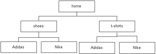
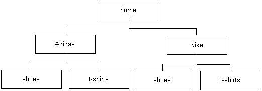
Let's say you're designing a site that sells T-shirts. And shoes. From two brands: Adidas and Nike. (It's that kind of site.) So you have a think about it, and decide you can come up with two possible hierarchies:


Obviously, we have a small problem: which one to choose? First, you can think about which one of the two dimensions of the company-product matrix (you're dealing with a two dimensional matrix, which is not too bad) has the least elements in it.
So you go to the client and ask if they plan to sell products from other companies in the future. You also ask them if they plan to sell more products. Turns out they do both, but there will definitely be more products than companies.
Two dimensions? We laugh at two dimensions!
So this all looks like you could organise it with companies on top, since there'll be a limited amount of companies. Maybe you can put the companies in tabs or something, you think.
But wait a minute: could there be more dimensions involved? Sure: women and men products. Someone could be looking for women shoes, or male Nike products. So now we have a three dimensional matrix to deal with, which gives us 9 possible organisations for the hierarchy we're trying to build. Feeling lost yet?
Users? Abusers!
This is were we have to start thinking about our users. There are lots of ways to organise this hierarchy, which one would be most beneficial to the user? An IA with unlimited resources would of course have a detailed task analysis to her disposal, but you don't. Oh well.
Let's see:
would a user be looking for an Adidas shoe? Or for a male sporting shoe? There's no way for you to know, so how do you find out? You ask the client, who hopefully knows his business. Maybe you try asking their salespeople, they should have experience with this.
The salespeople you talk to all tell you women always look by color, and men tend to look by brand. Cool.
You go home and cry on your significant other's shoulder, because your research has just introduced another dimension. Color.
A Four Dimensional Matrix
And there you are, stuck with a four dimensional matrix. What's a poor IA to do?
But when the going get's tough, the tough get rough. They give you a four dimensional matrix, you just pull out your users again. (By the way, more dimensions are imaginable: price, size, ... you name it. But we'll stick with these three for now. Yes, thank me later.)
You learned that women always shop by color, and men shop by brand (this is just an example, by the way). So you're going to assume for a minute that this is true for web shopping behaviour as well. Maybe you can divide the hierarchy into male and female shopping behaviour at the top? A "task driven" top level, as an IA would say when she wants to impress clients.
Or maybe you could make a funky navigation scheme that let's users choose from a few dropdowns and directs them to the correct node in our multidimensional matrix? The dropdowns could be actively adjusting to each other, so they would always only show appropriate choices, depending on the choices you already made. You asked your programmers, some funky DHTML can do that.
But wait a minute, what's that nagging voice in the back of your head? Is it trying to tell you something? It's waving its arms, flipping its legs and it's saying something, speaking some strange language...
... eh ...
... Swedish? Then you realise: of course, it's Jakob Nielsen telling you to Keep It Simple Stupid. Darn!
Back to the Drawing Board
Ok, you sit down again, and see where you stand. You've looked at the subject from a multidimensional angle, and you've learned how your users think. Now how can you present that in a simple navigation that will make sense for them?
Maybe on the homepage you can divide surfers in the male-female split, and design a different hierarchy for both? You'd have to test it though, to make sure it isn't too confusing. You usually want hierarchies to be exclusive (e.g. an item only shows up in one place in the hierarchy), so when using two hierarchies do they need to be exclusive as well? Could you come up with one hierarchy that fits that top level task oriented division?
Many questions, and I'm going to leave you to it. I've got work of my own to do. Remember, it takes work to build decent hierarchies and navigation schemes. And once you've come up with something, test early and often, with real users. Good luck.
Article History
I had this one in my head for a long time. Written and first published (at my experimental manila site: March 13, 2001. I was happy with it so submitted it to Evolt on March 14.

